-->
Showing posts with label Design Template. Show all posts

Almost every blog use popular post widget. That’s why I have designed this popular post widget for blogger. I have given 6 different image hover effects. You can use whatever you want. We know that, a lot of people are using Blogger for creating their professional or business website. If you are also running your blog on blogger and trying to improve your site’s outlook, then this is the right place.
Today I am going to tell you, how you can customize your blogger popular post widget? But before that, I would love to say something about why we need Popular Post widget. Popular Post widget can help you to improve your website page views

What type of blogging platform you are using doesn’t matter. I think that you obviously want to make your blog more beautiful to your readers. By customizing your Blogger blog, you can make it more user-friendly and eye-catching. If you customize your blog, then it will look like different and unique from others. That’s why today I will provide some best popular post widgets for the blogger with thumbnails.
There are many different ways to customize your blogger popular post widget. An eye-catching popular post widget will impress your readers. This will also increase the chance to get more clicks in your blog. Which will decrease the bounce rate of your blog and boost Alexa rank? Adding and customizing popular post is very easy. Just follow my instruction.


In Blogger, we have the option to set the number of posts we want to display per page by going to the Settings menu > Posts and comments > Show at most ? posts. Once the number of total posts in our blog exceeds this number, we will see "Older Posts" and "Newer Posts" navigation links in our home page and archive pages footer as Blogger doesn't have any built-in function on page numbering. But page numbers instead of older and newer posts links could help our blog visitors to navigate quicker (jump from one page to another page or click on a specific page) and know the total number of posts published.

So this tutorial will show you how to add numbered page navigation using Javascript to a Blogger/ blogspot blog. You can select one of the 7 available styles below.

[​IMG]
Related Post adalah suatu navigasi yang memungkinkan pengunjung untuk menjelajahi blog/website anda lebih lanjut dengan membaca artikel terkait. Pada suatu template yang terpasang di sebuah blog, ada template yang langsung meng-include-kan fitur ini, dan ada pula yang tidak. Jika template anda tidak terpasangkan Related Post/Artikel terkait, silahkan baca thread ini lebih lanjut.

[​IMG]
Related Post adalah suatu navigasi yang memungkinkan pengunjung untuk menjelajahi blog/website anda lebih lanjut dengan membaca artikel terkait. Pada suatu template yang terpasang di sebuah blog, ada template yang langsung meng-include-kan fitur ini, dan ada pula yang tidak. Jika template anda tidak terpasangkan Related Post/Artikel terkait, silahkan baca thread ini lebih lanjut

Umumnya elemen posting memiliki satu kolom. Sekarang tindakan apa yang dapat kita lakukan agar kolom posting itu menjadi dua? Sebelum memulai trik tersebut, alangkah baiknya jika kita memahami mengapa sebuah kolom menjadi dua. Pengkoloman terjadi apabila tersedia ruang kosong — biasanya — disebelah kiri pada sebuah elemen dasar, sehingga elemen di bahwahnya akan mengisi ruang kosong tersebut. Sedangkan elemen dasar tersebut harus memperlihatkan struktur inline & penempatan bernilai relatif agar — nantinya — mudah untuk dikustomisasi. Salah satu contoh penerapan adalah pada posting Membuat Template Blog Hasil Karya Sendiri di bagian akhir tentang cara membuat tiga kolom sejajar dalam elemen footer yang ditandai dengan selector.supplementary.

Pada posting sebelumnya, kita telah mengetahui tentang dasar penyusunan template di Blogger.com. Sekarang tinggal tergantung pada kreativitas masing-masing dalam menambahkan beberapa selector atau elemen HTML5 agar blog dapat ditampilkan pada layar peramban. Toturial berikut dapat diterapkan dengan cara yang berbeda pada tiap blog & tentu saja tergantung pada pengelola blog yang bersangkutan. Untuk pembuatan blog dari awal mungkin tidak akan menemukan masalah yang berarti, namun jika dilakukan pada blog yang telah memiliki posting, pembaharuan template kemungkinan besar akan meninggalkan residu dari pengkodean template sebelumnya. Adapun agar template kembali segar, maka dibutuhkan sedikit trik untuk melakukan reset template, yakni — dengan cara — pergi ke dashboard Blogger.com, kemudian “terapkan” salah satu template dasar.
Sebagai langkah pertama, silakan simpan (copy & paste) beberapa widget yang mungkin akan kita tampilkan dalam blog — seperti navbar, header, dan main (Posting Blog) — pada “Edit HTML”. Kemudian bersihkan semua kode, sehingga area “Edit HTML” menjadi kosong dan masukkan HTML (Hypertext Markup Language) berikut.

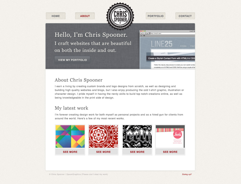
Over on my Blog.SpoonGraphics design blog this week, I posted a Photoshop design tutorial that takes you through the process of building a stylish portfolio design concept. Follow this second part of the tutorial here on Line25, where we’ll code up the design into a fully working HTML and CSS website. Stick around for part three, when we’ll go a step further and convert the static website into a WordPress build.

This tutorial covers part one of a multi-part series where we’ll go through the process of building a stylish design portfolio website. In this particular article we’ll create the visual concept and overall design concept in Photoshop, using various effects, blending modes and layer styles to create all the detailed elements of the design.
Stylish portfolio website design
The website we’ll be creating features a nice and clean layout and makes use of a contrasting header area to draw in the user. Otherwise the concept is styled with large typography and subtle details on the interface elements. Once you’ve finished your PSD concept, head over to my web design blog at Line25 to learn how to code up the design, then transform it into a fully working WordPress theme.
Open up Photoshop and create a new document. I tend to work with dimension of 1680×1050 to gain an idea of how the website will look on a widescreen monitor. Fill the background with a light grey/cream and give 2% worth of noise from the filter menu.
Right click and transform a selection to 960px, then draw guides to highlight the centre and each side.
Use the rounded rectangle tool to draw a content area, but leave the edges around 10px short of the guides to allow for a Drop Shadow effect to be added.
Paste in your logo in the centre of the design. If you fancy creating yourself a cool little emblem style logo like this, check out my old tutorial.
Use the rounded rectangle tool to draw a small button in the header area. Change the blending mode to Overlay to allow the underlying texture to show through.
Add a very subtle Inner Shadow to give the impression of an inset appearance. The key is to turn the opacity right down to around 10%.
Make copies of the button to either side of the logo, then add text to each navigation item. Typical pages might be home, about, portfolio and contact.
CMD+click the thumbnail of the of the white content area, then ALT-drag across the lower portion with the marquee tool to leave a shorter selection. Fill this area with black.
Load the layer styles window for this layer and add a Pattern Overlay. Here I’m using an iPhone 4 style fabric texture from Dr.Palaniraja.
Draw a thin 4px border across the bottom of the header area and give it a light grey fill.
Use a black to transparent gradient to draw a small shadow along the bottom edge of the header. Tone down the opacity to around 10%.
Use the Georgia font to add a stylish introductory title to the header area. Add a touch of tracking to space out the letters slightly.
Draw a button shape using the rounded rectangle tool, then use the layer styles window to begin sprucing it up. Begin with a gradient using a dark and light grey sample from the header background.
Give the button a beveled appearance by manipulating an Inner Glow into a thin light grey border, then add a 1px dark grey Stroke.
Finish off the button with a line of text and adjust the settings of the Drop Shadow effect to create an inset appearance.
Paste in a sample of your website design work in the header. Make a selection from the header area then add a layer mask to trim the screenshot to size.
Add a Drop Shadow using Photoshop’s layer style effect then right click and select Create Layer. Use the Warp function of the transform feature to bend the shadow outwards. Lower the opacity to give a more realistic appearance.
Use the typography from the header titles on headings in the main content area and write out the main body copy with a nice large sans-serif font.
Draw a grey rectangle as the base of a portfolio item preview, then give a rounded rectangle an Inner Shadow to create a subtle button element.
Finish off the portfolio item with a thumbnail with the project being showcased, then add a text link using the font styling from the navigation menu.
Group and duplicate the elements that make up the portfolio item then swap out the thumbnails to showcase your latest work.
Finish off the footer area with a copyright notice and back to top link. The main home page concept is now complete, so let’s flesh out the inner pages.
Duplicate your PSD and rename it to ‘About’. The inner pages don’t need a large header area, but we can use the space to display the page title. Trim the header area down in size.
Adjust the text in the header to introduce the page. In this case the About page can be titled ‘About Chris Spooner’ – Or it might be a good idea to use your own name.
Paste in your body copy to fill out the about content area. Don’t forget to leave space to display a picture of yourself!
The Portfolio page can be constructed by duplicating the portfolio items and replacing the thumbnail for each of your design projects.
Fill out the page with a selection of portfolio items. When we eventually build the website as a WordPress theme, each portfolio item will be created as a blog post.
Use a range of rounded rectangles to lay out a typical contact form for the contact page, then list out your favourite social website along with icons.
Stylish portfolio website design
Don’t forget to stop by over at Line25 to learn how to take your PSD concept and turn it into a fully working HTML and CSS website.

Membuat Sticky Menu - Pada tutorial terdahulu saya menjelaskan Cara Membuat Widget Melayang di Blog (Sticky Widget), saat ini saya akan berbagi bagaimana membuat Sticky Menu.

Dengan membuat sticky menu, tentunya akan memudahkan pengunjung mengeksplor blog sobat tanpa harus naik turun scroll. Sticky Menu ini awalnya akan terlihat normal, tetapi akan melayang (fixed) ketika mouse discroll ke bawah.

sticky menu

Meletakkan Judul dan Gambar di atas Postingan dan Sidebar. Postingan ini saya buat untuk mendokumentasikan tutorial blog yang saya dapat dari blokwalking. Dan kebetulan pada waktu itu saya ingin mencoba mengedit template yaitu dengan memindahkan Judul postingan dan gambar diatas postingan dan sidebar seperti pada template wordpress pada website national geographic.
Saya pikir jika di wordpress bisa, kenapa di blogger tidak? Kemudian saya mencoba membuat eksperimen-eksperimen namun hasilnya tetap saja gagal. Saya sempat frustasi, kemudian dari pada saya bingung, akhirnya saya teringat dengan salah satu master blog Indonesia favorit saya yaitu kang Adhy Suryadi dengan blog-nya kompiajaib.com. Ah..!! bukankah template Kang Adhy juga seperti yang saya maksud?

Menu merupakan salah satu navigasi yang paling diperlukan dalam stuktur blog. Banyak bertebaran di website-website tutorial blog yang menawarkan berbagai macam dan modifikasi menu navigasi.

Dan diantara sekian banyak menu yang paling saya sukai adalah menu push page. Mungkin diantara sobat semua ada yang belum mengetahui apa itu menu push page? Menu ini adalah navigasi menu yang jika diklik ikon menu kan muncul dari tempat tersembunyi dari kiri kanan bawah atau bahkan atas. Dan munculannya pun menjadi menarik karena seperti mendorong posisi layar blog.

Jika kita memakai platform wordpress, memang terdapat plugin yang bisa membagi postingan menjadi 2 halaman atau lebih. Di blogspot pun juga bisa. Namun mungkin hasilnya akan sedikit berbeda. Perbedaannya adalah, jika kita memakai plugin di wordpress, maka url yang muncul akan tetap alias sama antara halaman satu dengan yang lainnya. Namun di blogspot tidak. Mau tahu? Coba aja sendiri, hehehehhe.. :D.

Lalu apakah berpengaruh terhadap SEO? Mmm,, saya kira tidak. Maksudnya tidak tahu, hahahhaa... tapi mungkin tidak berpengaruh, toh yang dicari pembaca adalah konten, bukan yang lain. Jika kita mempunyai konten yang unik dan kita mensharenya ke media sosial, lalu pengunjung tertarik untuk membaca, walaupun blog itu mempunyai postingan yang dipisah menjadi 2 atau tidak, saya kira pengunjung tidak memikirkan hal seperti itu, yang penting mereka membaca. Udah, titik.

Related Post dengan Gambar
Cara Membuat Related Post dengan Gambar (Thumbnail Image) plus Judul di Bawah Posting Blogger.

POSTING tentang cara membuat related post dengan foto atau gambar thumbnail (Related Posts with Thumbnail Image) ini dibuat terkait pertanyaan dan permintaan seorang pengguna template New Johny Wuss. Ia ingin menggunakan posting terkait yang menampilkan foto dan judul.

Berikut CB share kode posting terkait plus gambar thumbnail dan judul sebagaimana yang digunkana tenmplate maskolis Pak Dhe Johny.

Teks yang ditampilkan di bawah judul post di home page blog berfungsi sebagai deskripsi yang mewakili isi dari postingan tersebut. Dan untuk memenuhi aspek artistik tampilan blog, panjang dan banyaknya karakter atau kata yang ditampilkan dibutuhkan jumlah yang pas sehingga enak dipandang mata.

Namun terkadang template yang anda gunakan kurang memenuhi aspek tersebut, bisa terlalu sedikit atau terlalu panjang. Meskipun template yang anda dapatkan sudah pas dan sempurna bagi desainer, tapi tidak bagi anda yang hobby utak atik template. Hal ini bertujuan untuk mempercantik lagi dan sebagai pembeda dari blog lain sehingga sampai level unik.
Dalam kasus saya, template yang saya edit deskripsi snippet home page-nya hanya berkisar 100 karakter dan memang itu adalah default dari sananya. Maka dari itu pada postingan kali ini saya akan jelaskan bagaimana agar deskripsi blog tersebut bisa kita ubah panjangnya sesuka hati. Simak caranya dibawah ini.

Membuat Menu Navigasi Melayang (Floating) - Ficri Pebriyana
Cara Membuat Menu Navigasi Melayang (Floating) - Membuat menu navigasi baru diatas header tetapi menu navigasu tersebut melayang atau floating saat kita scroll kebawah akan selalu mengikuti, ini menggunakan siste z-index yang dimana jika kita menggunakan sistem z-index ini seolah-olah terlihat melayang. Membuat menu melayang pada blog sangatlah mudah, kali ini blog ladaskipzen akan membahas mengenai Cara Membuat Menu Navigasi Melayang (Floating) Pada Blog, menu melayang ini disimpan diatas header dan mengikuti ketika kita scroll kebawah.

Menghilangkan Titik Hitam Pada Layout Blog - Layout atau tata letak pada sebuah template blog merupakan suatu rangka yang menggambarkan desain blog yang nantinya tampil di blog, namun layout ini bisa berbeda dengan tampilan ketika kita melihat blog kita di browser, misalnya header pada layout berada di kanan namun bisa saja kita tampilkan di kiri ketika dilihat menggunakan browser. Jadi, layout ini memang tidak terlalu berpengaruh penting terhadap tampilan blog yang muncul di web browser, tapi alangkah baiknya kita mengatur layout blog ini agar terlihat lebih menarik dan enak di pandang.